Crosswords for iPad
Tuesday, March 30th, 2010iPad day is nearly upon us, and we’ve been busy! We’re extremely excited about the new platform, and can’t wait to see what developers are going to do with it.
In trying to move Crosswords from iPhone to iPad we ran into a number of difficulties, most importantly, of course, the fact that we’ve never actually played with an iPad, nor held one in our hands. We’re trying a few new ideas out with Crosswords, and hopefully they’ll work out. This is all guesswork for now: we’ll find out on Saturday!
Here’s a sneak preview of what we’ve got coming in Crosswords 2.0:
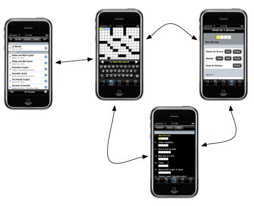
In trying to maintain the focus of Crosswords throughout the iPad version, we wanted to hone in one thing: solving puzzles. On iPhone, we’re forced to jump around to various screens, since you just can’t fit everything on one screen. With iPad, we can get the puzzle and most of the clues all visible at once, and eliminate jumping about.
For example, on iPhone, a typical puzzle playing session might see you select a puzzle from a list, enter some letters, get stuck and check hints, then look at the list of clues, etc.

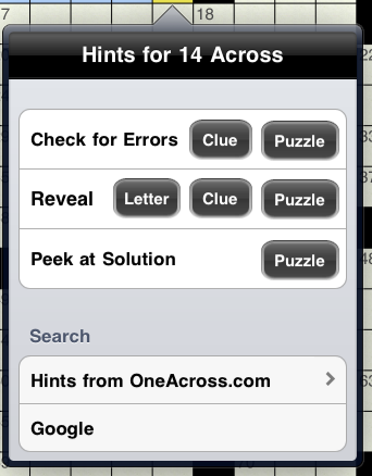
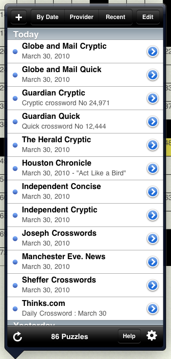
On iPad, we wanted to try and keep you in the puzzle as much as possible. We made the puzzle list a popup, so you could quickly switch puzzles, or check info, without having the entire puzzle disappear. We also wanted to make hints a little more contextual, so we now pop them up right from the puzzle itself.
One of the initial design decisions we made with the iPhone version was a custom keyboard: there was just not enough space on iPhone to justify using an entire row for the space, number lock, and return key. Using a custom keyboard let us control a lot more of the screen, and also allowed us to customize the look of the keyboard. However, we spent a long time trying to match the feel of our custom keyboard to iPhone’s built-in one. For iPad, we decided that a custom keyboard might not be necessary. The built-in keyboard still leaves us a lot of room to show the puzzle, and if the user hooks up a bluetooth keyboard, we can get rid of the on-screen one altogether.
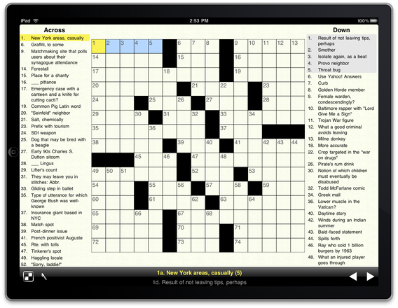
This allowed us to create a whole new look for the iPad version, one more akin to the familiar newspaper Crossword:

With this layout, you’re able to see the entire puzzle, as well as most of the clues. To get hints on a square, just touch and hold on it, and a hint popover will appear. To switch puzzles, you can just touch the Crosswords icon, and a list of all available puzzles appears.


Neither of these break the flow of solving; you can around from clue-to-clue, or even puzzle-to-puzzle, and always have a firm idea of the ‘big picture’ that you’re trying to solve.
Another of the major differences between iPhone and iPad solving is the length of a game session. Since your iPhone is always with you, you can pull it out, fill in a few clues, and then move on to something else. We think iPad is going to be used for larger chunks of time; you’ll probably sit down ‘ to do a puzzle’, rather than just solve a bit of one. With this in mind, we’re trying to show you all of the puzzle, and as many clues as possible, at once, instead of focusing on just one area.
We’ve got a lot more great puzzle-solving ideas that iPad is going to allow, and we’d love to hear feedback on what we’ve delivered so far.