New Product Updates
October 2nd, 2013We at Stand Alone have some major news on some product updates available today focused on and influenced by Apple’s release of iOS 7. The new app updates we are announcing today are: Crosswords for iOS 7, Crosswords Classic and Words Play 2.0.
Crosswords for iOS 7
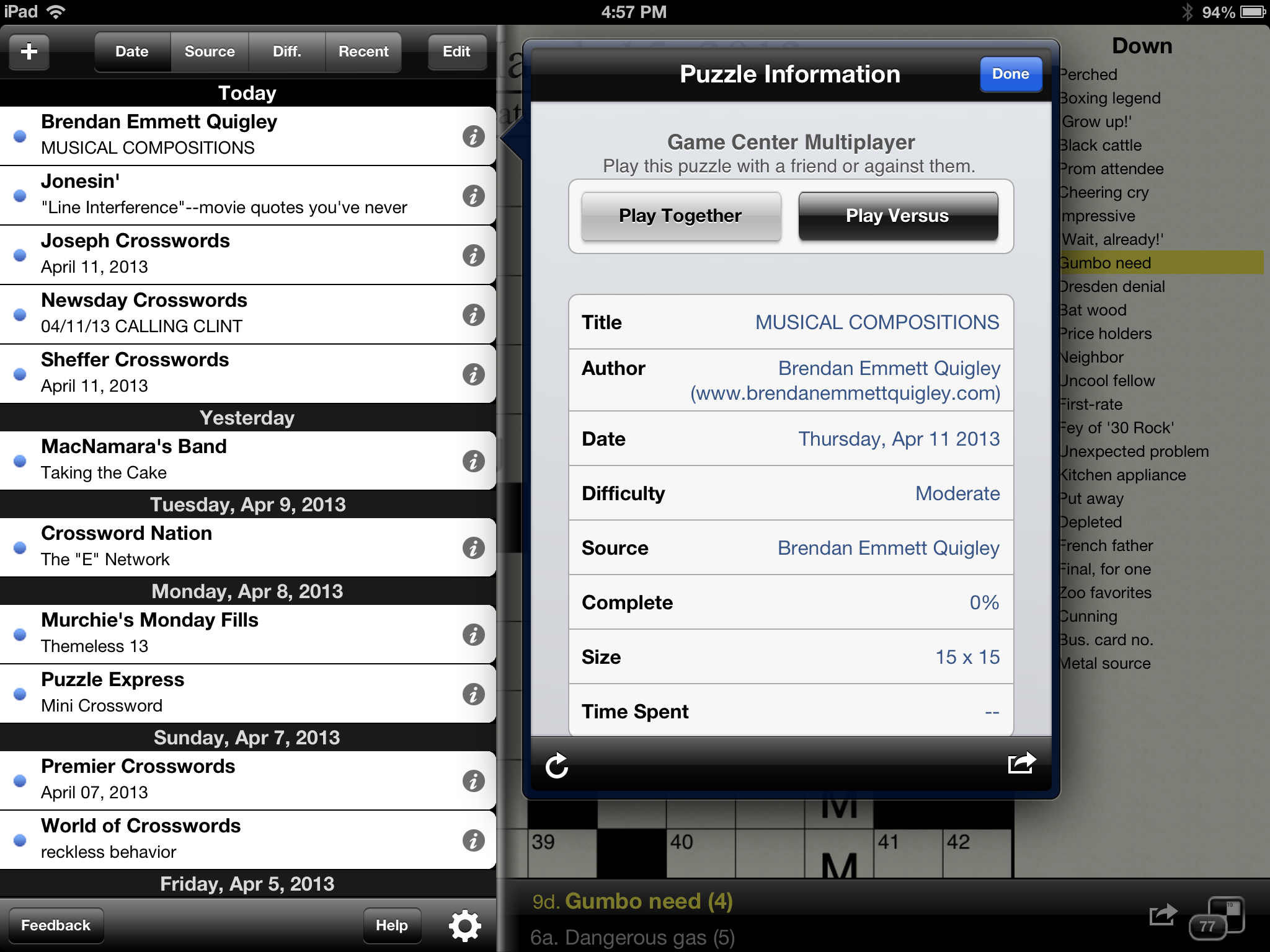
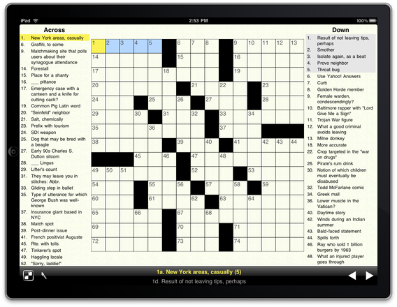
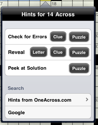
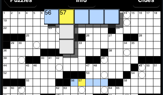
The first announcement is an all new release for our long standing AppStore classic, Crosswords. The new Crosswords release is iOS 7 only and will be called simply: Crosswords.
We felt for that we needed to redesign the app from the ground up for iOS 7 since the app’s origins date back to iOS 2. Since iOS 7 presented such a dramatic change it provided us the opportunity to make the changes we’ve been wanting to on a clean slate. We aimed to simplify the app which grew complex over the years all while not removing the power user features that our fans can’t live without. We think you’ll like what we came up with.
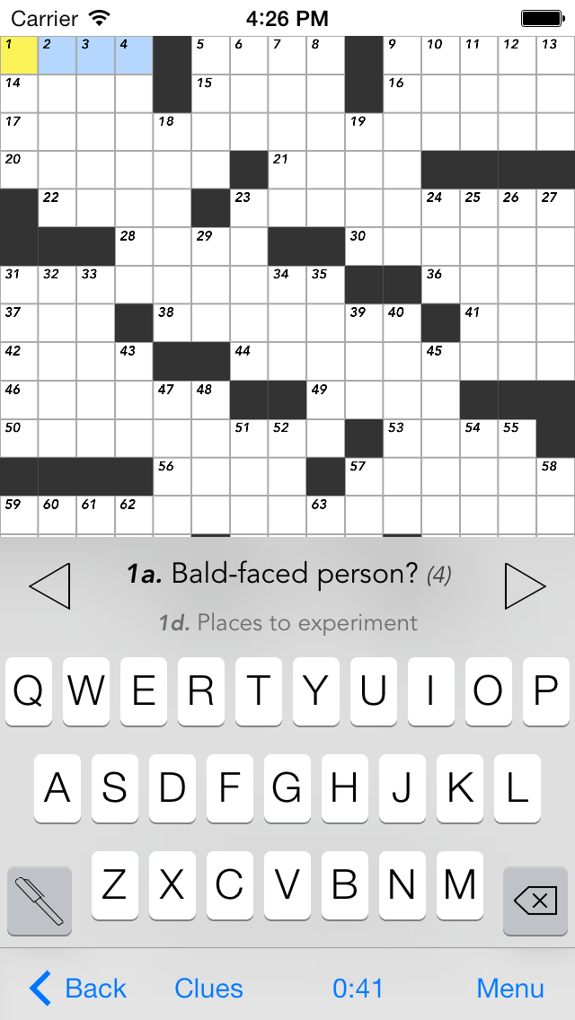
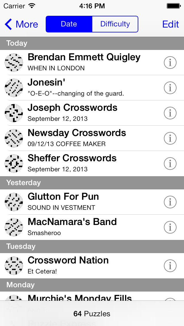
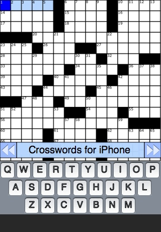
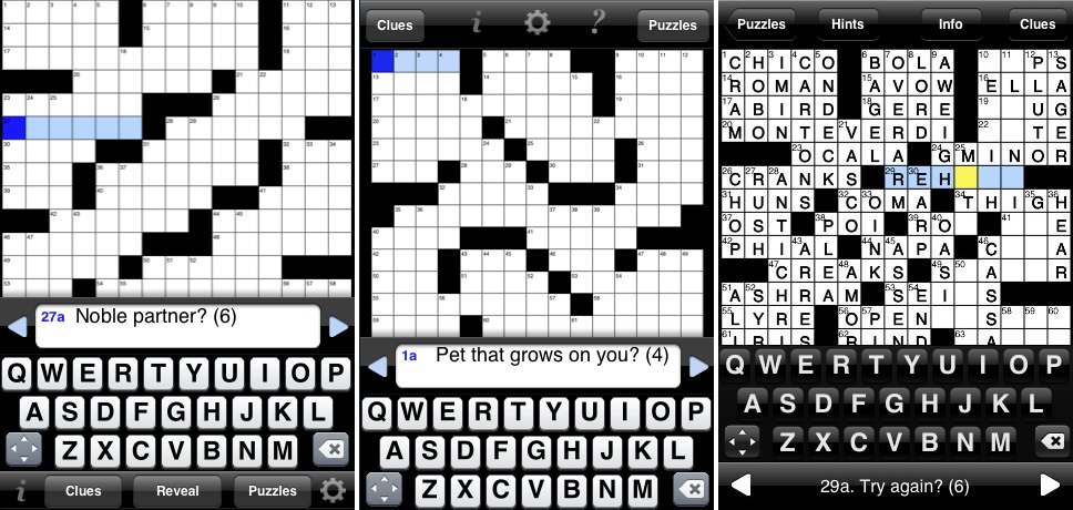
Crosswords for iOS 7 iPhone Screenshots
This new iOS 7 version of Crosswords is also now free to play with various puzzle packages and subscriptions available for purchase if you so desire. In addition to individual puzzle packs, there is also a Crosswords Pro upgrade for $9.99 that removes all the ads and gets you all the non-subscription puzzle content in one bundle.
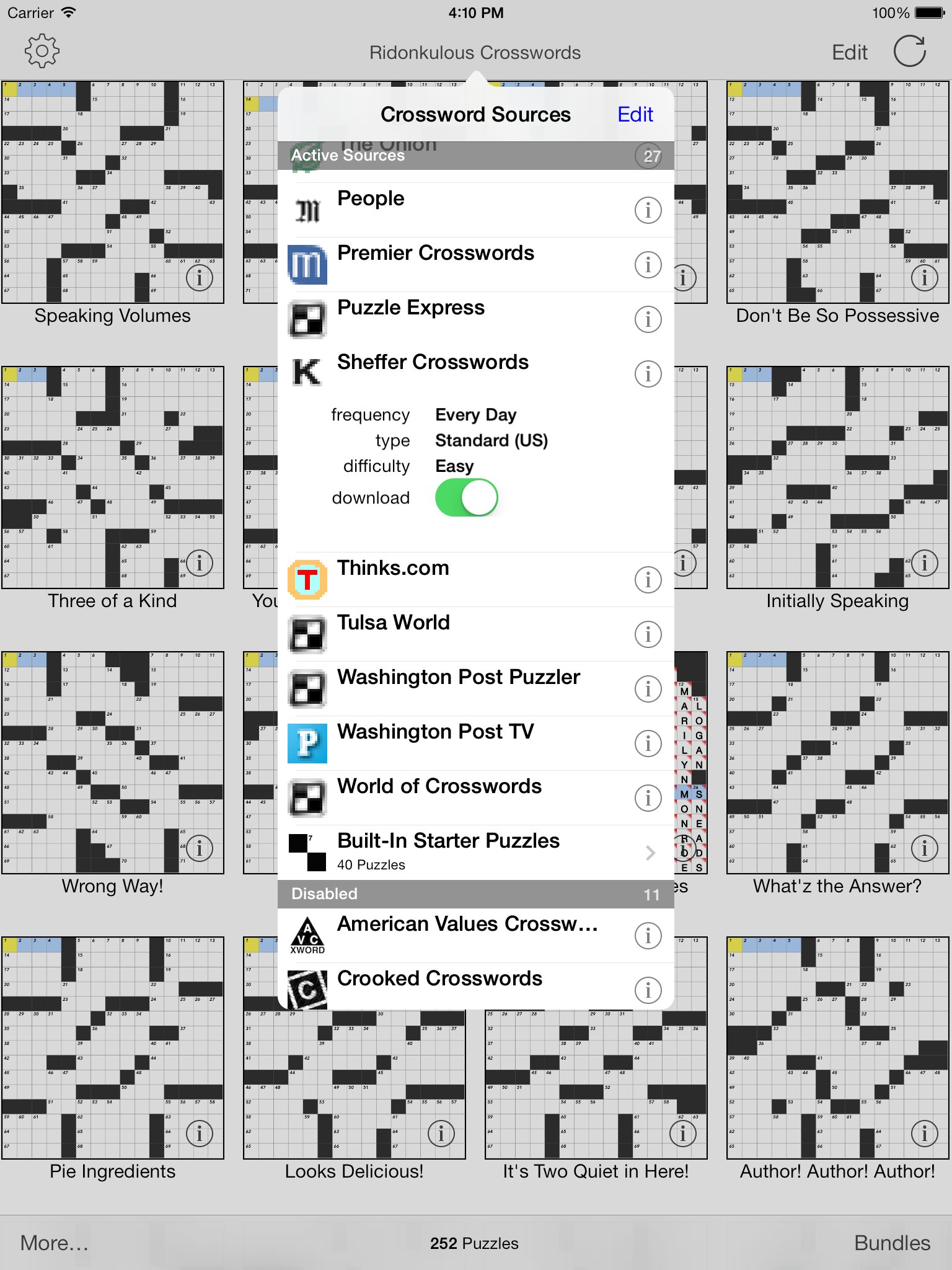
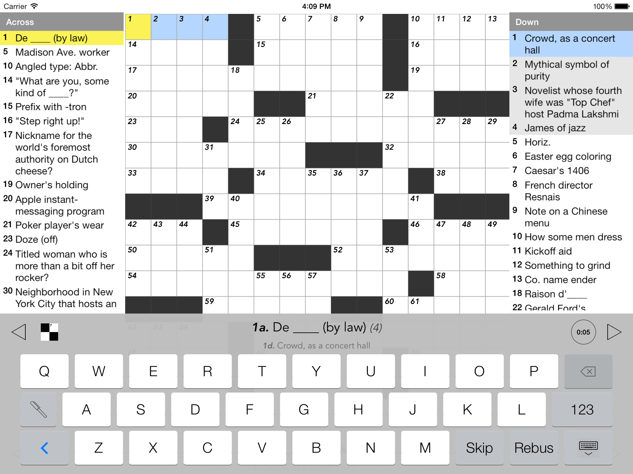
Crosswords for iOS 7 iPad Screenshots
You can download Crosswords from the AppStore starting today.
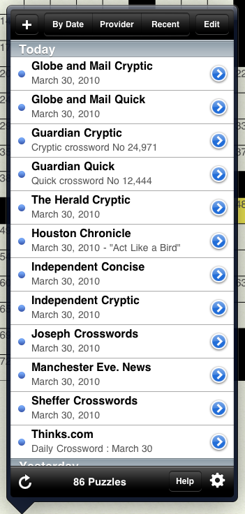
Crosswords Classic
The existing Crosswords is still for sale and has been renamed “Crosswords Classic” going forward. Crosswords Classic is the same app our customers have loved for years, and was even the Starbucks App of the Week earlier this year. Crosswords Classic requires a minimum of iOS 4.3 and is fully compatible with the newly released iOS 7. It just is not redesigned to take advantage of new iOS 7 features and functionality.
You can download Crosswords Classic from the AppStore as per usual.
Words Play 2.0
We also redesigned our competitive word puzzle game, Words Play, from the ground up for 2.0. The original concept behind the game was to make the best competitive word puzzle game, and we wanted to continue that tradition. The design we came up with before iOS 7 was revealed was already focused on creating a clean yet more colorful interface.
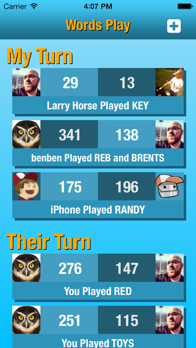
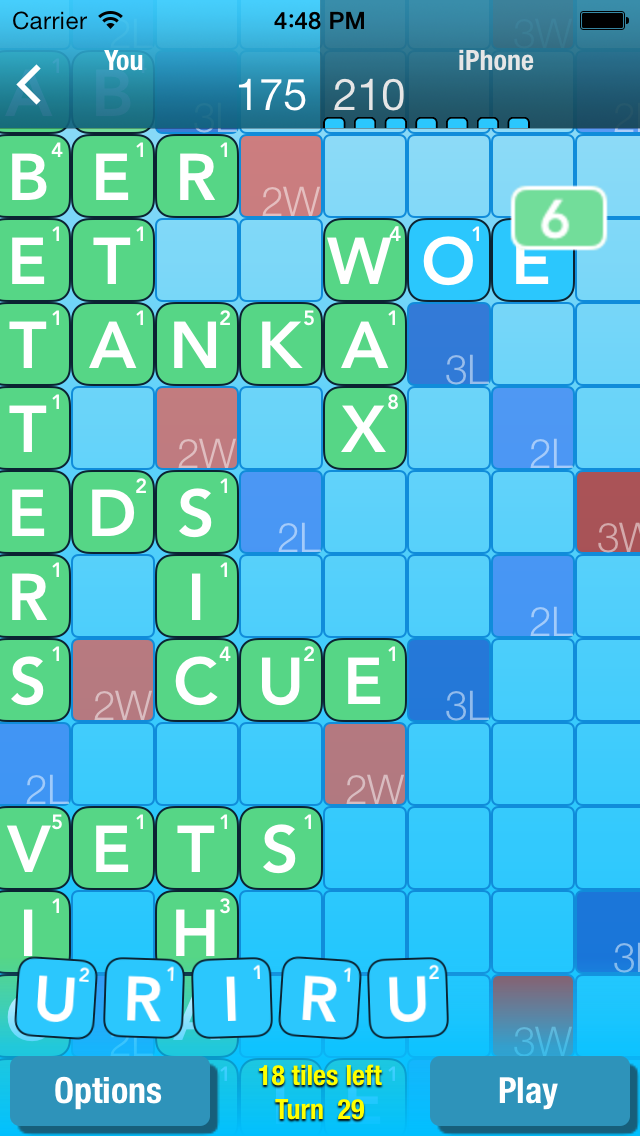
Words Play 2.0 iPhone Screenshots
Over the past six months we’ve iterated on that design quite a bit until we found something the whole team liked. Also since Words Play was a newer app so it allowed us to go with a hybrid iOS 6 and iOS 7 approach with little to no compromises.
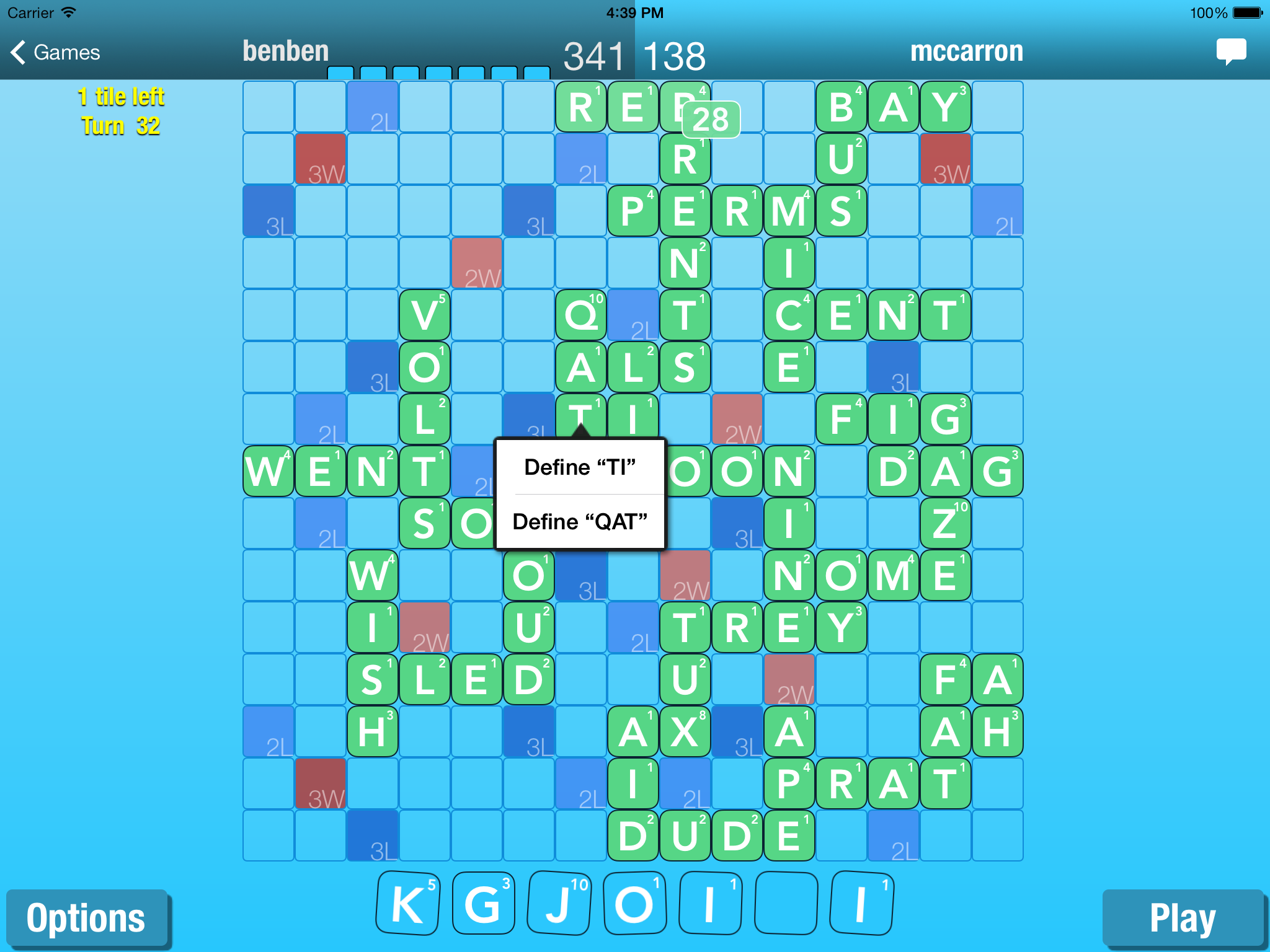
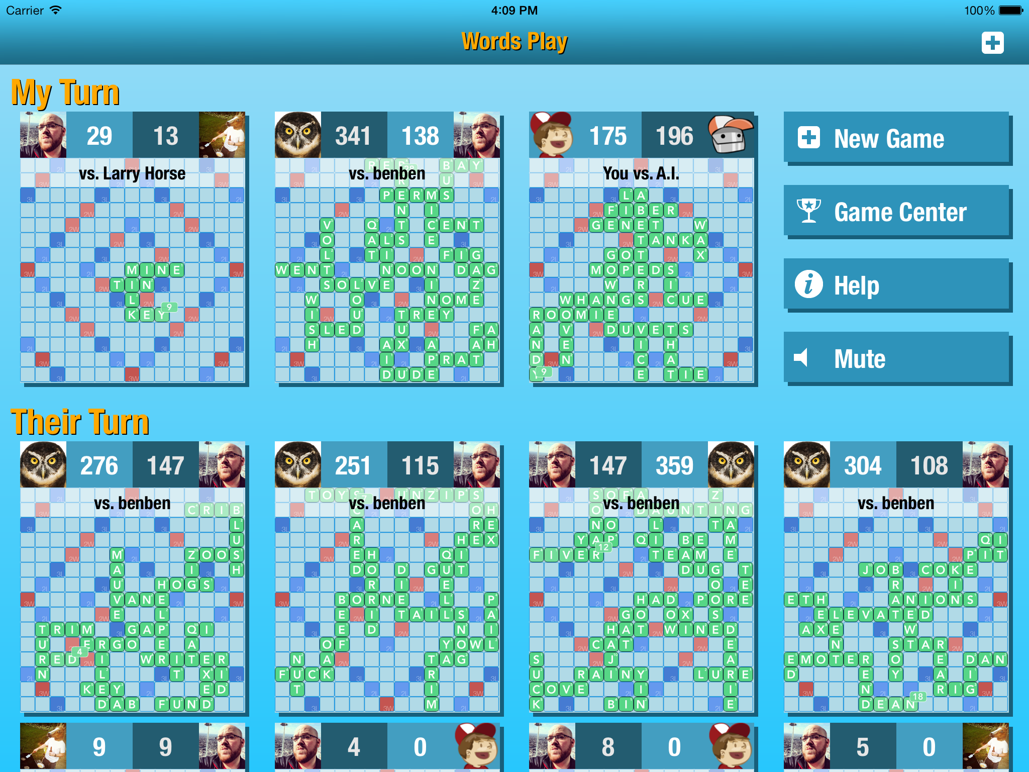
Words Play 2.0 iPad Screenshots
As part of the redesign process we also went in optimized the game heavily, fixing a lot of old issues and also laying the ground work for some new features and modes that will be coming down the road.
Words Play will still be only $0.99 but now you’ll get one free game against our “Robot” artificial intelligence opponent before requiring a purchase. So users can test their luck against the AI once for free to see if he’s worth the extra dollar.
You can download Words Play 2.0 from the AppStore starting today.