Puzzling Out an Interface
Monday, July 28th, 2008We in the iPhone development community face a rather large conundrum when it comes to blogs: we’d love to share what we’re finding out about this new platform, but are shackled in what we can say by the ongoing NDA covering all discussion. Given this constraint, I decided I’d talk about the design decisions we made in putting together Crosswords for the iPhone, rather than the underlying code (which hopefully I’ll talk about in a future, post-NDA entry).
First Pass: AJAX
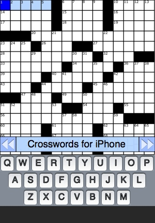
Just before the iPhone was released, we started work on a browser version of Crosswords. This gave us a good test-bed to work on some screen layout concepts, but the project never really got very far due to limitations in the iPhone version of Safari (specifically, there was no way to track a finger as it was dragged from square to square, which meant precise position of the ‘cursor’ was not possible).
Second Pass: Jailbreak Toolchain
With the release of the unofficial toolchain SDK in the fall of 2007, we decided a new approach was in order. Building off the design of the web version, we were able to add a good deal of functionality and usability to the design. Native controls allowed for faster display and more responsiveness, as well as an overall better feel.
We were still stymied, however, by a lack of precision when touching the screen. On previous mobile devices, you use a stylus to select elements on-screen. On the iPhone, of course, you use just your finger. While this has great advantages in terms of convenience and feel, it means you’re a lot less exact when selecting a spot (the finger presents a much larger ‘contact patch’ then a stylus.)
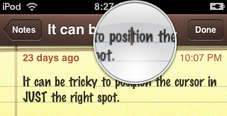
Apple has gone to great lengths to eliminate situations where precise pixel location is needed, but one example of where they couldn’t avoid it is in positioning the cursor. The solution they came up with is simple: zoom in on just a portion of the screen:
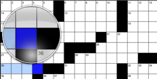
In Crosswords, we looked at pinch zooming, but felt it wasn’t the best fit for a Crossword puzzle. When zoomed in, you could easily select a square, but had to do a lot of scrolling for longer clues, or when jumping from one clue to the next. However, the zoom approach used in cursor positioning seemed a good fit, so we added a zoom loupe:
Third Pass: SDK First Try
With the release of the SDK came the much anticipated documentation. Finally we could get some sort of official word on the classes and method we were using (with the Jailbreak toolchain, all information available had been gleaned from trial-and-error, and was frequently incomplete).
Of course, the SDK required an almost complete rewrite of the application, so we took the opportunity to polish both the code and the user interface. We moved some elements around on screen, trying to find the best layout that maximized puzzle access while still allowing the user to use the keyboard and see clues.
With this version, we decided that perhaps the zoom loupe was not ideal for a crossword puzzle. We knew the exact area of interest (the intersecting clues that the user was attempting to tap), so we decided to zoom in on just those clues instead:
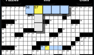
This has the advantage of allowing the user to focus on just the area where they’d want to enter letters, and position their selection precisely. However, it’s certainly not as aesthetically pleasing as the loupe, and gives no information about adjacent squares. This was used in the 1.0 release of the software, but we weren’t 100% happy with it.
Final Pass: SDK Refined
At Apple’s World Wide Developer Conference in June, we got the chance to sit down with some of Apple’s User Interface gurus and hash over our existing interface. Apple had some great suggestions, and also prompted us to take a look at what we were doing in some areas. One of their suggestions was to take our current black-and-white theme and extend it so as to really bring the eye’s focus to the puzzle itself. To this end, we inverted both the keyboard and the clue. Below, you can see the evolution of the design over time:
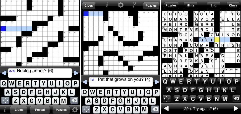
One the left, the Jailbreak toolchain version, In the middle, our first attempt with the SDK, and on the right, the finished product, after a UI review with Apple and some refinement following a lot of user testing.
Going Forward
With the 1.0 release, we’ve pretty much settled on an overall layout for the application, but we’re still refining the feel of certain features. For example, as mentioned earlier, we weren’t really satisfied with the experience of the zoomed-in clues; with the version 1.1 release, we’ve returned to the zoom loupe, and feel it works well.